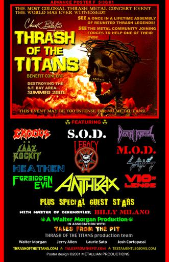
The best metal bands have always had distinct logos, and thrash metal bands have always had the best logos. You can argue that if you want, but you’ll be wrong. When I was a young whippersnapper back in the 1730’s, a bitchin logo was sometimes the single most important factor in deciding which album to buy. As the 1990’s churned along and 80’s metal became something of a taboo, a lot of the more well-known thrash bands changed their classic logos. In most cases, this coincided with a change in the sound of the band as well (and not always for the better).
Here’s a look at some legendary thrash metal bands who changed their logos in the 90’s, along with a brief examination of the album(s) where the change(s) occurred. Note: as proper logos were/are often not utilized on show flyers, those will not be considered in this discussion. Likewise, changes that occured before a band’s first official LP or EP release (i.e., on demos, etc.) will not be discussed; only official releases, beginning with the beginning. Also, this list is in no way meant to complete or comprehensive. Also, it is in no particular order. Also, it could probably be laid out more clearly, but here we are.
1. Metallica
![]()
Metallica’s logo evolved along with the band, but it was always based on that distinct stabbing M and A. Their classic logo is possibly the most recognizable logo in all of metal (even my 73-year-old parents recognize it). 1987’s The 5.98 E.P.: Garage Days Re-Revisited fudged the formula a bit by making the logo look like it was taken from the pages of a teenager’s school notebook, but like the songs on the tape, this was a nod to the band’s early days. 1988’s massive …And Justice for All reverted to the classic block format (quite literally this time, by making it appear to be carved in stone). On 1991’s Metallica (aka “The Black Album”), the logo is still pretty much the same, although it was blended almost entirely into the black background, not unlike the band’s thrash metal roots on this album.

This motherfucker is still selling over 200,000 copies a year.
The first real, concrete logo change came with the release of 1996’s Load, which of course found the band slowing things waaaaaaay down, and dabbling in country music and straight-up hard rock sounds. Everything about the cover of Load hinted at a drastic change in sound, tempo, tone, and attitude.

Gross.
They used this logo again on Reload, and 2003’s late term abortion St. Anger saw another evolution of the logo, back into something more like the classic logo, only more “edgy” and “stupid”.
![]()
They reverted to the original logo on 2008’s Death Magnetic, and used a slightly altered version of it on 2016’s Hardwired…to Self-Destruct (which, while probably their best album since Metallica, is still not that great), but it doesn’t matter anymore.
2. Anthrax
![]()
I always loved Anthrax’s logo, not to mention Anthrax. They were my first favorite band, and I was a proud member of their fan club for a couple of years in the early 90’s. Their sound evolved somewhat throughout the 80’s and into the 90’s, but it changed a lot in 1992, when longtime singer Joey Belladonna was shown the door and former Armored Saint frontman John Bush stepped in. Bush’s debut, 1993’s Sound of White Noise, was a pretty big step in a new direction for Anthrax, with more of an emphasis on vocal melodies, lower tunings, and slower tempos, but it also comes off (to my ears) as a natural continuation of the sound the band had harnessed on 1991’s stellar Persistence of Time. As such, the change in the logo is slight (perhaps imperceptible to the casual viewer).
Bushthrax
1995’s Stomp 442 is a horse of an entirely different color. All references to the classic, pointy logo were gone, and in its place was a weird, wavy block letter thing, almost unnoticeable down in the lower left corner of the bizarre cover.

Yeah, I don’t really get it either.
The changes didn’t stop at the cover, either. Longtime lead guitarist Danny Spitz left the band after SoWN, and with him vanished nearly any musical connection to the Anthrax of old. Solos still came along (many were played by drummer Charlie Benante, with two guest solos by Dimebag Darrell), and the riffs were still there (albeit much simpler), but overall it was a much more straightforward hard rock album, and was nowhere near the neighborhood of a thrash metal album. Every album since Stomp 442 has utilized a version of the classic logo, but they’ve gotten less interesting as time has gone on.
On a side note, I can’t be the only person to notice the similarities between the Anthrax logo and the Toyota Matrix logo, can I?
3. Testament
![]()
Holy shit do I ever love me some Testament. Their first logo change can be found on the cover of 1990’s Souls of Black, but it’s really nothing more than a separation of the letters in their classic logo, as seen above. The band’s sound didn’t change drastically with the cover.

The follow-up, 1992’s underrated The Ritual, crammed the letters back together and turned them into an inverted pentagon/implied pentagram, resulting in a pretty bitchin cover that hinted at a sound more evil (and perhaps more akin to their earlier, more sinister-sounding songs) than what was contained within.

Fantastic cover, fantastic album. Not nearly as evil or comparatively heavy as the cover implies.
The Return to the Apocalyptic City EP (1993) returned the logo to classic form (and threw in a completely fucking bitchin cover, to boot).

See?
In 1994, the band released their final studio album on longtime label Atlantic Records. Low returned the logo to the Souls of Black-style separated letters, and this time, the sounds were noticeably different. Lead guitar maestro Alex Skolnik left the band after the The Ritual, and his replacement by the supremely talented yet stylistically very different James Murphy (Obituary, Death) ushered in some pretty big sonic changes. The album is excellent from beginning to end, and it still sounds like Testament, but it has a decidedly heavier edge than anything the band had released prior, even dipping their toes in the death metal end of the pool with side two opener “Dog Faced Gods”.
This heavier verison of Testament stuck with the newer, separated logo for 1997’s Demonic, then simplified it even more on 1999’s absolutely essential The Gathering (with the second version of the logo incorporated into the artwork) before reverting to their classic logo with their return from hiatus, 2008’s excellent Formation of Damnation.

Boring logo, weird cover, amazing album.
Today, the band kind of goes back and forth between the two logos, and they still kick loads of ass. Their most recent album (Brotherhood of the Snake – 2016) is my least favorite so far, but it’s still better and more consistent than most other classic band’s modern offerings (I’m looking at you, Metallica, Anthrax, and Slayer).
4. Slayer
Fucking duh.
Speaking of Slayer, their logo is likely the second-most recognizable in the world of thrash metal (and is probably the only one that could really give Metallica’s classic logo a run for its money as far as recognizability), and their first six releases utilized it to varying degrees, with it being most prominent (i.e., mostly unaccompanied) on 1984’s absolute banger Haunting the Chapel EP.

The cover of 1992’s Seasons in the Abyss marks the first of two albums in a row without the logo anywhere on the cover, but the sound didn’t change drastically with either album. 1996’s pretty good collection of punk and hardcore covers Undisputed Attitude returned it to a sort of prominence, albeit in the form a fan-worn t-shirt.

In 1998, the band released the weird, mostly slow, chuggy, nü-metal-influenced Diabolus in Musica, and anyone paying attention was tipped off to the change when they saw the cover, which, while creepy in its own way, bore absolutely no resemblance to any previous Slayer release.

This may as well have had flashing red lights and sirens on it.
The next few albums varied in their use of the logo, and the most recent album, 2016’s Repentless, brought back the orginal logo (along with echoes of some of the classic artwork), but the magic is pretty much gone at this point. At least we have their first 4 1/2 albums, right?

Fucking beautiful.
5. Megadeth
![]()
Megadeth is a unique on this list in that they changed their logo significantly two different times. The first change occurred between their debut (1985’s Killing is My Business…and Business is Good!, with its classic speed metal-esque, Motörhead inspired cover) and their second album (1986’s godly Peace Sells…but Who’s Buying?) but did not accompany a major change in sound (though the quality did improve significantly. The band stuck with their new, iconic logo (above) from Peace Sells… up through 1995’s Hidden Treasures EP (an overall solid collection of soundtrack/compilation songs and covers).

In 1997, Megadeth died, and Dave Mustaine released Cryptic Writings, an album which marked a drastic change in the band’s sound. They’d already slowed things down quite a bit with Countdown to Extinction (1991) and Youthanasia (1994), but Cryptic Writings found Mustaine and co. actively working to make a more commercial sounding, radio-friendly album, and the results are not so good, but they’re miles ahead of its follow-up, 1999’s Risk.

[sad trombone sound]

Ugh.
Dave Mustaine has remixed, remastered, and re-released Killing is My Business…, Cryptic Writings, and Risk in the past few years and they all have new artwork featuring the classic logo, but don’t be fooled by Cryptic Writings or Risk . To be fair, I haven’t tried listening to either Cryptic Writings or Risk since probably 2001 or so, but when Peace Sells…, So Far, So Good…So What! (1988), and Rust in Peace (1990) all exist, I don’t really have a reason to try again.
Megadeth returned to their classic logo with 2001’s The World Needs a Hero, and have used that logo on every release since, with the exception of one live album and one greatest hits/best of compilation. Musically, they have remained a mixed bag.
6. Exodus
![]()
Exodus released three crushing albums between 1985 and 1989, then began to falter a bit. 1990’s Impact is Imminent is good, but it’s not as solid as any of its predecessors. In 1992, they released Force of Habit, which is still a good album, but it is perhaps most notable for slowing down the breakneck tempos quite a bit, and for the weird, weird graffiti cover, complete with spray-painted logo.

Major label influence and declining record sales are a hell of a drug.
It was the last album Exodus released until 1997, when they reunited with original vocalist/lunatic Paul Baloff (RIP) and recorded a fucking amazing live album called Another Lesson in Violence. They have utilized their original logo since that album, and they have continued to crush skulls and snap necks since.
7. Overkill
![]()
New Jersey’s Overkill are one of thrash metal’s unsung heroes, churning out good-to-great albums with an almost alarming consistency since 1985. Like all bands not called AC/DC, Motörhead, or Ramones, their sound has changed a bit, but unlike all the other bands on this list, their logo has not changed at all since their first album. The sole exceptions come in the form of live album (1995’s Wrecking Your Neck) and an album of covers from 1999 called Coverkill, which did have a weird ransom note-esque logo at the top, but also included the original logo at the bottom as part of the album title.

I don’t know that Overkill’s musical consistency and logo consistency are related, but I do find it interesting that they are the only thrash band from the 80’s that both never broke up and also never changed their logo in the 90’s.
8. Iron Maiden

Someone did my work for me. Thank you, anonymous stranger!
Iron Maiden is obviously not a thrash band, but they did have a subtle logo change, and I love them, so I’m including them on this list. The logo is iconic to say the least, and the band is quite possibly the biggest metal band in the world (only Metallica could conceivably compete for that title at this point). They had a bit of a rough go in the 1990’s, first losing longtime guitarist Adrian Smith in 1990, during early work on No Prayer for the Dying, followed by vocalist Bruce Dickinson in 1993 (after touring for 1992’s Fear of the Dark). Smith was replaced by Janick Gers, and Dickinson was replaced by Blaze Bayley (whose band Wolfsbane had opened for Maiden during their 1990 tour). This lineup released two albums, 1995’s excellent The X Factor, and 1998’s kind of okay Virtual XI.
The cover for The X Factor is strange, but the logo is more or less the same, and the songs sound more or less like Maiden songs, albeit with a very different voice. Virtual XI, however, is different. Superficially, the logo was changed ever so slightly to be flat across the bottom. The album itself has some very high highlights (album opener “Futureal” and “The Clansman”, especially), but it has some real duds on it, too. The second track, “The Angel and the Gambler”, would be pretty solid if it was 3 minutes long, but instead it drags on for just shy of 10 minutes, most of which is just the chorus, repeated repeatedly. This has become a recurring issue on Iron Maiden albums, as Steve Harris seems to have begun writing songs specifically for a live audience to sing along with. Whatever, they still kick unbelievable amounts of ass live, and I still love them.
The original logo was utilized on a few compilations throughout the 2000’s, and made its unassuming return on a studio album with 2015’s The Book of Souls. Merchandise is available in both logo styles, i.e., with or without “tails”.
9. Voivod
I’ve written a lot about Voivod, so I won’t get into them here, other than to say that their logo has changed with every single release, just as their sound has evolved with every single release. While I’m not sure about the other bands on this list, I can say with certainty that Voivod’s logo changed each time to purposely reflect the evolution of the sounds conatined within the albums. If you don’t already, you should listen to Voivod. If you do already, you should listen to them more often.
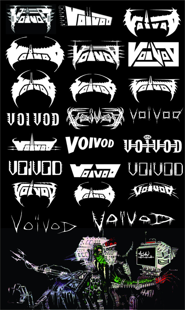
These are not in order, but they are all fucking badass.
What can we glean from all this? Fuck if I know, I just love heavy metal, appreciate a well-crafted logo, and realized that no one had really written about logo changes as hints of musical changes (based on my very limited research).
Anyway, thanks for reading, and thanks for staying heavy with me.